Hometown research 28/09/2023:
For my work experience project, I picked Cricklewood. Cricklewood spans three boroughs, Brent, Camden, and Barnet. Created in 1294, it was named after a small settlement called ' Le crickleldwode'. Buses and trains are the most used public transport here, buses such as 189, 226, 260, and 460 run services regularly. Cricklewood train station is a popular method of transportation in fare zone 3, the Thameslink services in Cricklewood run to and from Sutton, St Albans, Luton, etc. The nearest tube stations are Willesden Green and Kilburn, Jubilee Line in zone 2. The colour scheme of the buildings is mainly brown red, and white, Victorian-style buildings. The Crown Hotel is a big part of Cricklewood's history, built in 1899, by architects Shoebridge and rising.
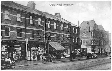
Historic photos of Cricklewood:
Full view of Cricklewood, via Google Maps
Buses used in Cricklewood


Mapesbury Dell is a small, quiet, park opened in 1979 by the Brent council. Transformed in 2005 by local residents, this park has become a best-kept secret, perfect for summer. Nearby shopping centres such as Brent Cross and Staples Corner are busy spots to pick up essentials and shop for clothes. For my project experimentation, I thought I would redesign the transport options since it's quite limited to residents who don't own cars as their main transportation methods are trains and buses. My redesign idea for transport is to make it more accessible for people who rely on public transport, some disadvantages could be busy and crowded buses, train cancellations, or streets that are not as accessible to people with disabilities or injuries. As part of my redesign transport experimentation, I looked at the busiest times to use public transport in my area. On Mondays to Fridays, the busiest times at Cricklewood train station are between 4-6 p.m., with trains arriving every 15 minutes.

Here are some tourist attractions in my borough;
Camden Market is a popular attraction amongst tourists, food bloggers, and locals. From food and drink to clothes and shoes, Camden Market is a lively place full of different foods for a range of different cultures.
.png)
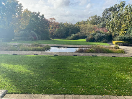
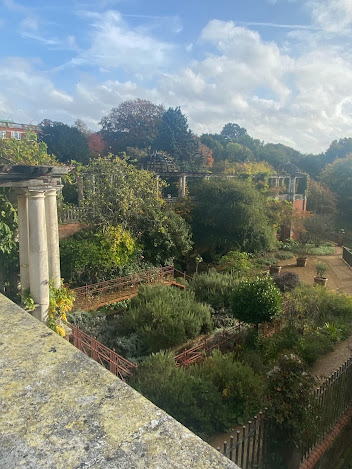
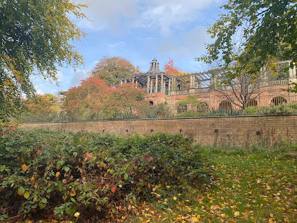
Golders Hill Park is 15 minutes away and popular because of its scenic views. The Hill Garden and Pergola is a great place to take photos and look at the flowers and natural beauty. Here are some of my own pictures that I've taken while at the park. Spring and summer are the best seasons to visit because of the flowers blooming, and you can see wisterias, roses, and violets, this garden is a hidden gem of North West London. Rebuilt and extended by Sir William Viscount, the gardens were restored by the London County Council and opened to the public in 1963. For my logo redesign, I've decided to remake the Camden logo. It has an interesting design and it would be fun to experiment with the different possibilities. As part of my primary research, I'll gather data about the main methods of transportation used in different boroughs, colour schemes, slogans, etc.
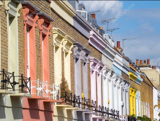
Colour scheme of the houses
Analysis of areas around Cricklewood 28/09/2023:
One of the places that I’ve chosen to analyse that’s close to Cricklewood is Golders Green, it's roughly 6 minutes away by car and 17 minutes away by bus from my house. Golders Green is an area in Brent which was founded as a Medieval Hamlet in the large parish of Hendon. It's easily accessible for me since I live close to multiple bus stops and take the Northern line from Golders Green station occasionally. Described as a cultural and diverse area with shops and restaurants along the main road, Golders Green started off as a small suburban linear settlement, the history of Golders Green dates back to the early 19th Century. This area is considered to be middle class, at one point it was famed for its largely Jewish-owned shoe shop and high-end boutiques. The Golders Green Hippodrome opened in 1913, it was a theatre, music hall, studio, and BBC recording studio. It was built to serve North London when the Northern line extended onto Golders Green. The most used method of transportation is similar to Cricklewood with their residents using buses and the tube daily. The Golders Green tube station opened in 1907, services on the Northern line include Edgware and Morden. This station is used daily, with 5.79 million people entering in 2022. With being on the fare zone 3, the tube comes on an average time of three minutes, making it reliable and easy to plan your trip with. There's also a coach station right when you step outside, open from Monday to Sunday, 8AM-8PM servicing the National Express coaches, it's even more convenient for passengers, making Golders Green a good hub for transportation. The station has these facilities:
- Payphones
- WI-FI
- Waiting rooms
- A ticket hall
- Lifts from street-level to platform-level
- Newsagents
- Coffee shops
- Ticket machines
This was the closest I could find to a logo for this area, underneath the picture I linked the Golders Green website for further information.
The next widely used method of transportation in Golders Green is buses, the bus and the underground station are near each other, making it convenient for commuters. Buses that I’ve used while in Golders Green are the 102, 13, 460, 328, and the 139.

Directions to Golders Green from my house
Tube service times
Golders Green tube station and the bus terminal in the 1950s
Poster for Golders Green which advertises their leisure activities, created in 1908
The colour scheme of Golders Green is light brown and white, similar to Cricklewood. These houses in the Golders Green neighbourhood look like Victorian-era, semi-detached houses, I would expect families or elderly couples to live around here. There are rarely any brightly coloured houses in Golders green, giving off the image that it’s practical and sensible. Unlike the houses in Camden Town, these houses are colourful and fun, adding colour to the boring brown buildings. The houses also attract tourists, making it more likely for people to want to live nearby.
Vibrant and pretty houses in Hartland Road, Camden
Another one of the areas that I'm analysing is Willesden, which has been in the borough of Brent since 1965. Dating back to 939 AD, Willesden meaning 'Hill of the Spring' was originally a place of pilgrimage. Willesden became a Civil parish in the Medieval times, much of this district supplied apples, pears, and vegetables for many years when the Industrial Revolution was taking place. The parish of Willesden was mainly rural up until the opening of the Metropolitan Railway in 1879, by 1906 The population had grown to 140,000. The Metropolitan line service was withdrawn in 1940, to be replaced with the Bakerloo line, later replaced with the Jubilee line as we know it today. Willesden's transport is mainly buses and the tube. Willesden bus garage was built in 1902 and various London bus routes serve Willesden here are a few, 6, 52, 98, 260, 226, 297, and 460. There are a range of activities to do in Willesden, including visiting Gladstone Park, and Roundwood Park, there are also various food and charity shops to go to. Willesden Green is celebrated for its diverse community, with their independent shops and businesses, Willesden market is open every Saturday and Wednesday and has a range of stalls to choose from.

Willesden Green underground station, 1900's
Willesden Green Station now, the original Metropolitan sign is still on the top of the building
Map of Willesden
Willesden Green Library, the original library was built in 1894 and later extended in 1907 to two storeys. The current building was redeveloped in 2011, containing a public library, 40,000 books, a museum, an art gallery, and a performance space. The colour scheme of Willesden is similar to Cricklewood and Golders Green, having white, black, and brown as its primary colours. Here are a few images of houses in Willesden:
Willesden Sports Centre is a leisure centre that opened in 1965, open 7 days a week from 6am-10pm. Their gym is accessible to pay-as-you-go customers and members who sign up for £34.99 monthly. The sports centre offers a list of these facilities:
- Studios
- Running tracks
- A sports hall
- Swimming pools, 25m and 12m swimming pools offering lane, general and full lesson programme swims
- Gym, 110 gym stations including, treadmills, cross trainers, a weight room, and personal fitness planning
- Cafe
- Meeting halls that are available to hire
- Sauna and steam rooms
They also have a range of clubs that you can join, such as gymnastics and a karate club.
Street view of Willesden Sports Centre
My own photos of Cricklewood 25/10/2023:
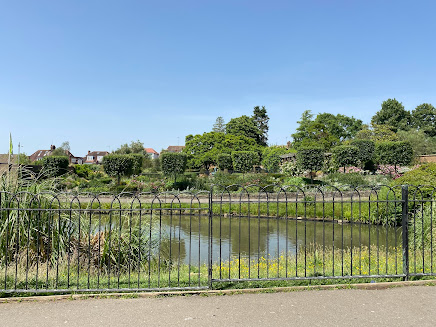
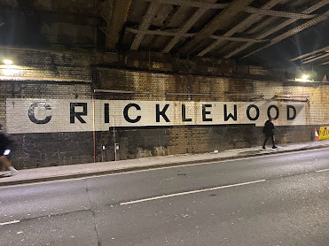
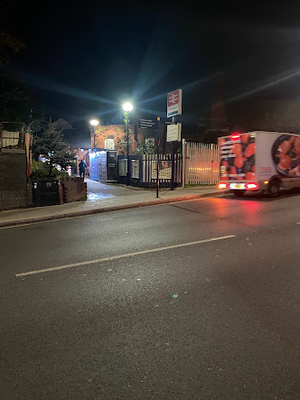
I chose to take pictures of places that I've included in my photo collage of Cricklewood, showing you how it looks in real life. I took pictures of places that are popular, e.g. the Crown Hotel which is a luxury 4-star hotel, attracting guests from outside Cricklewood. Cricklewood station is the most used transportation here with 0.612 million that have used the station from 2021-22.
The Crown Hotel
Cricklewood train station at night
Redesign planning 02/11/2023:
Cricklewood doesn't have a logo so when researching logos, I looked at the logos for my boroughs, such as Camden and Barnet. When designing the logo for Cricklewood I looked at other areas of logos as inspiration, choosing which colours to include, motifs, and shapes. I'll use that when experimenting with different designs. These designs are simple, and use basic fonts but are still unique. For my design, I want to use a symbol of Cricklewood that everyone recognises, making my logo stand out. When I sketch my logo, I'll draw different design options that still fit my criteria. For my logo design, I was thinking of creating a motif of houses in Cricklewood or I could incorporate the Cricklewood sign in big and bold letters, then add the 'Cricklewood' name in the 'Playball' or 'Dancing Script' font.
.jpg)
Typeface options
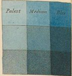
For the colour scheme planning and experimentation, I used Pinterest as a source of colour swatches, I kept my options open using different colours ranging from bright to plain colours. Since the colour scheme of Cricklewood is mainly darker colours like brown and black, I went in the opposite direction and used colours that are a little bit lighter, dark blue or light yellow for a colour scheme. I then made two different mood boards of the new and the current colour scheme of Cricklewood, for my new colour scheme I stuck with the dark and light blue colours. The reason why I chose the colour blue is that it's a basic and simple shade, not too vibrant but it's still colourful depending on the shade I'll use. To create my new colour scheme, I'll use Photoshop to edit the blue shades onto my own photos of Cricklewood.
My favourite colour of this swatch was 'Jazz Age', 'Electric Grid', and 'Crystalline' the scheme of this redesign is cool tones.
Colour scheme mood boards:
New colour scheme:
Moodboard of the current colour scheme of Cricklewood:
I'm going to be using this photo as experimentation, using Photoshop or Illustrator to change the colour of the building from a light, dusty shade to a deep, darker blue shade
Google Maps street view
Transport proposal and research:
When researching the most used method of transportation in Cricklewood, I used my own routes to include the train and bus numbers. One of the buses I take is the C11, a single-decker with 52 stops from Archway to Brent Cross; the average wait time for this bus is 10 minutes. This bus route is useful but stops in busy places such as The Royal Free and schools around the area. The C11 often has bad traffic on some of these routes, making this bus quite crowded. My idea for this redesign is to make the bus bigger, adding more seats to make it more comfortable and accessible for the passengers. For the new design, I used the new Routemaster bus as inspiration, it's a low-floor, diesel double-decker, this bus has 3 doors and can accommodate 87 passengers, making it more accessible to the general public. The 214 is a great example of a spacious single-decker bus that reduces air pollution and improves air quality.


The C11 bus route
This is an example of the Enviro 200 MMC bus, and what the C11 bus should look like, the Enviro Dart 200 (the current design of C11) needs to be updated and should be replaced with an electric bus. A few benefits of an electric bus include:
- Sustainability - Electric buses help reduce the amount of reliance on fossil fuels, and the reduced pollution helps electric buses provide cleaner air for the population. A 2018 study suggested that even when electricity generated to operate and charge the buses was taken into account, electric buses produced fewer greenhouse gases. Replacing a diesel bus with an electric bus can save 1,690 tons of greenhouse gas emissions annually
- Positive impact on the community, electric vehicles are quiet, helping reduce noise pollution in urban areas. The lack of an engine results in reduced noise pollution and the smell of fumes. Noise is reduced and there's an increase in comfort for passengers
- Greater energy efficiency
- Improves living conditions for the residents, and using electric buses more means better air quality in our cities. Electric buses operate without tailpipe emissions, significantly reducing harmful pollutants such as nitrogen oxides
- Maintenance costs are reduced - Electric buses have fewer moving parts compared to a bus that uses diesel, resulting in reduced maintenance requirements and lower associated costs, electric motors also have a longer lifespan.
My proposal for the new and improved C11 bus includes:
- Comfortable and more spacious seating
- Roomier space for disabled and buggy users
- Charging ports for the passenger's convenience
- Lots more standing room, e.g. handlebars
- Updated bus times, sometimes when waiting for the C11 bus it can be unreliable because of how crowded it gets as it's only a single-decker bus
I was thinking of changing the interior of the buses too, this seat pattern is a good one because it's red and grey, matching the bus. The current bus seat interior looks a bit dirty, it could do with some updating as it's been 13 years since the last bus model change. There are hundreds of passengers talking about how long this bus service takes. The fact that it's always an inconvenience because of the poor service, unreliable timetables, and constant roadwork in busy areas where the C11 runs through. Here are some local news articles I found on the public's opinion on the C11 being outdated. As you can see from these articles, many people agree that the current C11 is slow and an inconvenience to their journey.

Exterior of the Routemaster
Another bus design I've been using as inspiration for this redesign project is the new Route Master, described as a low-floor, double-decker bus that has 3 doors, these buses can be found all over London. It entered service in February 2012 and is notable for having a "hop-on, hop-off" rear platform similar to the original Routemaster bus. The design for the new double-decker was inspired by the AEC Routemaster, featuring three doors and two staircases to allow accessible boarding. Current routes that operate with the Routemaster bus include the 189, 73, 68, 137, 148, 67, etc.
Interior of the bus
ULEZ (Ultra Low Emission Zone) is an initiative proposed in 2019 by the Mayor of London that aims to reduce the amount of pollution in London, the zone operates across all London boroughs and the City of London. The ULEZ standards are:
- Euro 3 for motorcycles, mopeds, motorised tricycles and quadricycles (L category)
- Euro 4 (NOx) for petrol cars, vans, minibuses and other specialist vehicles
- Euro 6 (NOx and PM) for diesel cars, vans minibuses and other specialist vehicles
Moodboard of new slogan:
To create the new and improved slogan for Cricklewood, I looked at slogans of other boroughs, including Islington and Harrow. Since Cricklewood is a part of three boroughs I used that in my research to add to the slogan when planning for this. The slogan for these three boroughs is:
- Camden: Not for oneself, but for all (Non Sibi Sed Toti)
- Brent: Forward together
- Barnet: Unity makes service
I also explored the slogans for other boroughs in London, some of them were in Latin. Here is a list of some borough's slogans that I thought were interesting:- Harrow- The good of the people is the highest law ( Salus Populi Suprema Lex)
- Hackney- Being fair is what makes us strong (Justitia Turris Nostra)
- Haringey- Progress by humanity
- Croydon- Let us strive after perfection (Ad Summa Nitamur)
For the idea of the slogan, I tried to incorporate the Camden and Brent logo together, a few ideas for this slogan were: "Together as one, we can move forward in the right direction", and "Cricklewood, a community that strives for progress and unity". Another idea I had is to use the Cricklewood sign as a slogan when passengers enter and leave Cricklewood train station, e.g. "The Cricklewood community gives you a warm welcome!". The final slogan I ended up choosing was 'Cricklewood: striving for unity and progress', I think that this slogan fits Cricklewood the most since the area could use some improvement and it shows that a positive change is being made.
These are good examples of welcome signs close to my hometown area, the Barnet sign has a slogan and a logo as well as a clear font, making it easy to understand when you come across it.
My idea was to add some sort of welcome sign near the station, using the slogan below the 'Cricklewood' sign using old-style fonts like Monotype Corsiva, Cardo, French Script MT etc.
Moodboard of the new slogan. I used Canva to create this, adding all of my initial ideas to the moodboard including the slogans of the different boroughs around Cricklewood, such as Brent.
Experimentation:
Logo experimentation:
When drawing the new logo of Cricklewood, I used my iPad to create the sketches and drew them on paper. First, I wrote my ideas down, what I wanted the logo to look like, the fonts, colours, and the shapes that I would want to use. I used Word to create the logo, my initial idea was to use a circular shape, adding the word 'Cricklewood' inside the box, I drew a picture of a house and added that inside it too. For the colours of the logo, I thought of using plain colours, such as white or grey but then I decided to use colours that would be on theme with my colour scheme, such as a dark or light blue shade. I drew the house in a dark blue shade, I then used word to add 'Cricklewood' in the size and font that I wanted.
The blue shade that I used for the house motif
I used Cricklewood as the main focus of my logo, putting the house drawing in the back of the shape. For the house motif, I used housing that you would see around Cricklewood to create the sketch,
One of the first sketches that I used as an idea of what I would've wanted my logo to look like, I used Word to draw a few of my house sketches.
Colour scheme experimentation:
For the experimentation, I first looked at the current colour scheme of Cricklewood. I took a look at the houses using the Google Maps satellite view option. The current scheme of the buildings is very plain, having mostly grey and brown colours. When I looked at the current colour scheme of Cricklewood overall, it became clear what should be changed, I chose to change the colours of the buildings from a light, boring and plain shade, to a more colourful shade of blue that would make Cricklewood stand out. I've decided to use Photoshop as the main application to experiment with the new colour scheme since I'm confident in using Photoshop more than Adobe InDesign.
For the colour experimentation I used Photoshop, and I replaced the teal colour of the Barnet sign and filled it with different types of dark blue shades using the paintbrush tool. I created another page and then used white as the sign background so the black text could be seen more clearly. I added my slogan ‘Cricklewood: striving for unity and progress’ onto the sign, experimenting with the different fonts and sizes to make sure that all of the words would fit on the sign.
First experiment with the words included on the sign
When choosing the new colour scheme for the buildings, I made sure to choose a colour that was vibrant and stood out enough for people who would view it. I changed the colour of the top half of the building and left the bottom half of the picture with the original colour, as a comparison of the before and after. Originally, I was only going to create one picture of the new colour scheme. Still, I decided to incorporate the ‘Cricklewood’ sign into the designs since it’s a significant reminder of Cricklewood to passers-by. Using the black and white text, I went into Photoshop and changed the sign into the chosen shades of blue, it looks kinda messy to me so something I would do next time is clean up the edges a little, making it neater. Whilst creating my design for the new colour scheme, I mainly used Photoshop and with the help of Adobe colour to pick out the shades of blue, using the colour tool I was able to create and change the colour scheme of the buildings from greyish tones to a blue hue. I tried out a range of blue shades from dark to light blue, I preferred the midnight blue shades rather than the lighter shades, and ultimately I used a deep shade of blue in my colour scheme design. I used this colour mix to create the chosen shade:
- Hue, -1
- Saturation +44
- Luminance -39
- Temp -100
- Tint -16
- Vibrance 0
This was my first experiment for the building colour scheme, since it was the first rough design there are some things I could’ve improved on when creating this. One of the main things to think about is making sure that the buildings are aligned with one another, making sure that it matches up, for this design I definitely could’ve done better with the top half of the building looking very wonky and the traffic lights being uneven. As it was only my first attempt, I went over these mistakes and used them in the design process to create a better, even, and clearer design. However, I kept the original colour scheme and kept a note of it as it had a good shade range.
For the ‘Cricklewood’ sign shade change experimentation, I used both Adobe Photoshop and Illustrator this time. Using the paint tools and the shape tools to change the black and white lettering to a deep blue whilst leaving the background the same colour as the original as I did in the first photo.
Final transport proposal sketch:
Here's my sketch for the bus remodel, I drew multiple different sketches for the bus proposal, including a wheelchair ramp to make it more accessible for handicapped passengers. The outer exterior of the bus is similar to the Enviro 200 MMC bus, the current design of the 214 bus I showed as an earlier example. The exterior and interior of the 200 MMC bus looks more presentable in comparison to the design of the current C11 bus. When looking at the current design of the C11 bus, I decided to look into the statistics of pollution in London caused by buses that use diesel.




.png)







.jpg)



.png)

.png)


.png)


No comments:
Post a Comment