Area of investigation

 Mise En Scene 16/10/2023:


In this picture, the dim lampshade is the main source of light, the key light. The open blinds are the backlights, creating more light in this scene. The lighting shows the audience the character's injury.


This image is an example of lowkey lighting, it has two sources of light, the key light and light that is in the background that isn't shown. The key light provides lighting for the character and the car. The use of rain in this photo could be portraying what's happening in this scene. The fact that the man is standing out in the rain instead of being in his car shows what emotions he could be feeling. Darkness can be used to show the weather and the character's facial expressions.


This scene is a good example of high-key lighting, the sources of light are artificial which could highlight the setting of this scene. Key light and backlight are used here, portraying the tension between these two characters based on their facial expressions. The newspapers in the background tell the audience that there's some sort of investigation ongoing, this could be the cause of the tension between these two characters.


This scene has lowkey lighting, the key light is the yellow light coming from the inside of the building. The only two lights used are the key light and the backlight, used to highlight the characters in this photo. This could mean that the two other characters could've been having an argument based on the facial expressions of the woman. In this scene, darkness is used to reflect the light to the key light, the woman's shadow highlights the lowkey lighting used in this scene.


The setting of this photo is chaotic it could be set in a war or a tragedy, based on the fire in the background. Weather is used to portray the theme of this photo, using cold weather to highlight the background. The messy, dirty clothes and the bag the man is holding could mean that they're trying to flee from the danger based on their terrified, scared facial expressions. The positioning of the characters shows that they're witnessing something shocking, leaving the audience to guess what's happening.


In the photo, the character has a puzzled look on his face as he's looking up at something. We can see that the props he's using are a laptop, a foldable chair, and a table in the background. The setting of the scene is in dark, desolate woods. From the props, the audience can gather that the character may be going camping or he lives there. The colour is moody, setting the scene of darkness, the lighting used is natural, ambient lighting, for the landscape setting. The content on the laptop suggests to the audience that it might connect to why he's in the woods, e.g. research, or a mysterious investigation, looking for something or someone? The positioning of the character with his legs stretched out on a chair tells the audience that he's in a relaxed and comfortable position, the mystery of him looking up at something adds mystery and intrigue to the viewers. Based on the character's clothing and devices this conveys that this photo is set in recent times, the 21st century or late 1990's. The audience's attention might be attracted to the reason why the character is staring upward, bringing more mystery to this scene.


The lighting used in this photo is an example of motivated lighting, setting the scene that this is at night, in cold weather. Based on the weather and the ice, it's clear that this photo is set in the water because their clothes are wet. The makeup and costumes give the audience some idea of what the theme of this scene is, the characters could be in distress, danger, or having a sad moment. Their facial expressions give major clues to the emotions and feelings of the characters. The audience can figure out that this is a tragedy by the way the characters are holding onto each other. The colours
 used in this photo are mainly blue and black, giving the feeling of a moody, melancholy scene.


National Gallery and other trip photos 18/10/2023:


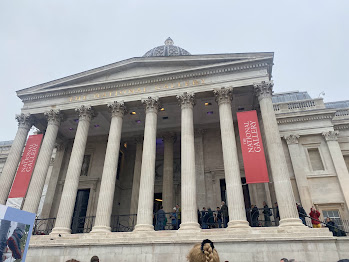
Outside of the National Gallery


Trafalgar Square


From the trip, the painting that I kept going back to was the portrait of Lady Jane Grey the 17-year-old queen who was executed 9 days after becoming queen. This is my favourite painting in the whole National Gallery as it portrays her pain and sadness as she's being killed. Her emotions in this painting convey how young she really was, making this an emotional painting for the audience. 


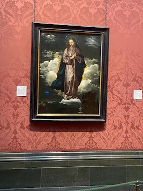
 I took pictures of paintings that I found interesting, this one caught my eye because of the stars floating above her head.


Monet's Waterlilies painted in 1899


Queen Mariana of Spain in mourning, painted by Juan Bautista Martinez Del Mazo in 1666


Painted by Camille Pissarro in 1869


Laduree Bakery in Covent Garden, famous for its macarons


Chanel store

Glossier store 
Typographic rules for magazine design 16/10/2023:

Here are some typography rules when designing a magazine:
  • Define clear entry points, entry points help keep readers engaged and encourage them to read the article. Entry points can include titles, drop caps, headings, and graphic elements that direct the reader to the text.
  • Line length is the distance between the left and right edges of a text block. It improves the amount of people who'll want to read your work, each of your lines should be between 45 to 90 characters including spaces. Shorter lines make a big difference, showing that your work is professional and neater. Long text can be hard to read for some people as there's a long distance between the next line.


  • Alignment left is the most common way of setting type as the majority of readers read from left to right. There are four basic typographic alignments; flush left, the text is aligned along the left margin or gutter, flush right, the text is aligned along the right margin, justified is when the text is aligned along the left margin with letter and word spacing adjusted so that the text falls flush with both margins. The last type of typographic alignment is centered when text is aligned neither the left nor right, there's an even gap on each side of each line.
  • Allowing visual space on a block of text makes the reading experience more enjoyable, you can do this by applying first-line indent.


  • It's important to consider what fonts would work well together when creating good typography, keep the X height the same or similar between the two fonts which adds contrast. Two different fonts in one article in digital magazines are enough, considering the reader's preferences and the content themes included.
  • Hanging punctuation deals with moving punctuation marks outside of their designated space and into the left side of the margin, making the content visually aligned.  Optical marginal alignment keeps the hyphenation outside the text frame.
  • In typography, all caps are seen as unprofessional and untidy, setting text in all caps decreases the ease, speed, and overall appeal of reading to the viewers. All Caps can make reading slower, causing the audience to become uninterested. Although all caps can work on titles, headings, and pull quotes.

Mood board of my idea 
30/10/2023:


For my project idea in the area of investigation, I chose the art of crochet. The reason why I chose crochet as my theme is because it's my main hobby, I started crocheting in 2022 and I feel inspired to surround my project around it. I have many pictures of my own creation process and the designs which is one of the reasons why I chose crochet. With crochet you can make anything, whether it's a hat, gloves, or a scarf, crochet is easy to get into with just a YouTube tutorial, yarn, and a crochet needle. For my mood board, I used Pinterest to get pictures of crochet fashion magazines, tutorials, designs, and projects. I chose pictures similar to projects I've finished and the tutorials I've used as a guide. The pictures in my mood board are based on magazines, websites, and projects that I'll use as inspiration when designing my website and planning to create my own original imagery. For website inspiration, I researched crochet websites such as:


Magazine design analysis 30/10/2023:

In the magazine cover the model is positioned balancing on her hands and toes, creating a weird posture. The background location and costume have a pink theme, with a pink cowboy hat, adding to the cover title of a teenage girl. The company title is in big, bold, bulky orange letters. This magazine cover also includes some of the movies that the model, Alicia Silverstone has starred in, giving their audience further information on her. Her hair is down, the facial gestures are neutral and there aren't any props included in the cover. Something that first drew me into this cover was the costume, the pink clothing gives a girly, feminine feel to this cover, highlighting the main title. The subtitle 'Congress attacks abortion' is eye-catching and can be intriguing to the readers as it includes a serious topic. 

Fans of Alicia Silverstone or daily readers of 'Rolling Stone' could be interested in this magazine feature, gaining more traction. More female audiences may be attracted to this cover because of its feminine, bright colours and themes rather than male audiences. The lighting is soft, and delicate and conveys the title of the cover through the model's pose and clothing. A range of different fonts and typefaces are included in this cover, the one that catches my eye the most is 'From Crazy to Clueless'. This font is unique, includes a star motif, and reminds me of a Wild West movie font.

https://new.express.adobe.com/id/urn:aaid:sc:EU:1eb87687-c0b4-4623-9128-d98437170e19?invite=true&promoid=XXTQGVMK&mv=other


Although the inside of the magazine has completely different hairstyles, props, makeup, and clothes it gives an entirely new look to the audience. The cover title is included again on the outside of the gum bubble, in my opinion, it's a creative and innovative way to display text, attracting their targeted audience. The words on the cover are chunky, large, and white, and the gum design is unique, making the words stand out more to their audiences. The photograph is shot from a low angle, highlighting the model's features, her makeup look has a childish, silly feel.


Magazine spread analysis:

The reason why I've chosen this spread is that this spread has detailed information, a good picture, and a great design. The type in columns also aren't too long which I think makes it easier for the reader to focus on the text as well as the content. There's a pull quote that attracts the readers upon first look, and the lighting is made to focus on the main subject, which is Lana. The red, white, and black lighting illuminates her face. It might be a bit hard to read so I added the link to the original picture to get a better look at it. The language used in this spread is informal but personal as it's talking about a photoshoot featured on the previous pages. The audience for this cover would be fans of Lana Del Rey and readers of the magazine, the text colour is all black.

Website critique 06/11/2023:

https://uk.glossier.com/


Glossier is a company that sells minimalist beauty products such as skincare, fragrance, and makeup. I would say that their target audience is people who are interested in skincare and makeup, fans of the company, and anybody who wants to try their products since they've been trending on social media platforms. It was founded in 2014, Glossier is known for its' no makeup' look with its products, their slogan is 'Skin first, makeup second'. 


Bestselling products

The aim of this website is to sell their products to their targeted audience. The design of their website is visual-based advertising with photos of their products being on the front page appealing to their viewers with a limited edition holiday collection. The information about the company, products, and reviews are neatly arranged with small and black writing, you can find their products easily by scrolling down to where it's alphabetically arranged. Glossier's social, contact information, and stores are included when you scroll all the way down, in my opinion, it is very accessible. There's also a FAQ and a help page which is useful for finding out commonly asked questions.


Glossier's Instagram page


Store location information

On the front page of their website, there's a highly rated review for one of their fragrances, influencing their audience based on this customer's positive experience.  This website also includes influencers wearing their hoodies, this could bring more attention because of their platforms.
Reviews of their 'Balm Dot Com' lip product


They've used videos of their best-selling 'Glossier You' fragrance including models trying them on in a montage type of way. Glossier's website is very well organised and easy to navigate, making it easier to find its products and other related information. Their links and information included are related to the company and they have reliable sources from other companies such as Cosmopolitan, Refinery29, and Allure, which could gain more positive attention from their readers. 'Into Glossier' is their company's blog including news about their employees,  their grant program, and an introduction to their new CEO.


This website was a great example of a good website to annotate because of :
  • The design
  • Bestselling products included
  • Visual elements of their website
  • Honest reviews 
  • Includes a discount for first-time customers
  • Product presentation


H&M is a retail brand that sells fast fashion clothing at an affordable price, their targeted audience is mainly women but the product demographic fits everyone. H&M's competitors are other popular clothing companies, such as Mango, Forever 21, and Zara. The use of visual elements on their front page is mainly Christmas-themed, advertising their winter clothes, an exclusive collection, and a black Friday discount. The front page is decorated with their black clothing line,, matching the colour palette of the models on the front page. One thing that works well with the H&M website is the visuals, advertising their latest seasonal collection for gift ideas, home decor, and party looks for the Christmas season.


H&M's social media platforms are easy to navigate as the related links are on the bottom of the home page, they also have a newsletter that has exclusive offers, style tips, and the latest news for their brand. H&M has a variety of clothes to pick from, from sportswear, party wear, nightwear, etc. The main colour palette of their website is white and their logo has been red since 1968, in my opinion, this logo is the most recognised in terms of clothing stores, reflecting the power and style of the brand. Their links are relevant, the information is valid, and a store locator option is available for customers to take a look at their nearest store, making it accessible and convenient.
Store Locator


Latest newsletter


Customer service page:


H&M also offers a rewards point system to customers with memberships, it's easy to access you can sign up using an email. Their points system includes benefits such as:
  • Free returns and delivery
  • Offers and discounts
  • 25% off an item on birthdays
  • Early access to their sales
  • Event Invitations


The aim of this website is to sell formal wear, its target audience is whoever is attending a prom, party, or formal event e.g. The design of this website is very chaotic, with bright colours, large pictures, and a range of graphics that aren't related to what's being advertised. Other links don't include formal wear, which makes it hard for their customers to navigate their chosen products. The layout of this website makes it difficult to tell what this brand is selling, the messy background, unrelated pictures, and links, different styles of fonts, and use of an excessive amount of visual elements.

Indesign exercise 06/11/2023:


When creating my magazine cover, I created an A4 document in Indesign. I picked the page option and selected both pages of the A master. I opened margins and columns, adding 3 columns and increasing the gutter size to 6mm. Selecting the typography workspace, I adjusted the margins to be 10 at the top, 25 at the bottom, 15 inside, and 20 outside, making sure that the rulers are visible. I created a guide at the foot of both pages 10mm from the bottom, adding automatic page numbers on both pages aligned at the center of the page to be aligned with the guide. I used the text box to create a box to add placeholder text on all of the boxes, then repeated the same step on the second page. I used a picture of a gradient from a past project which I think fits that spread. To change the typeface font and size I had to highlight the text and make the text size 100 pt, ensuring it fits across the first three boxes of the magazine spread. To add the picture I had to do text wrap which wraps around the object shape. If I were to try this exercise next time, I would be a bit quicker since this experiment took longer to complete than I'd expected it to. Something that I'd do better next time is to make the lines neater, especially around the picture since the edges of the picture are hanging outside the text boxes. 


Magazine cover planning 08/11/2023:

For my magazine cover planning, I used interest to get inspirational pictures of what I would want my cover to look like. I found modern and older magazine copies which influenced my magazine cover planning better by using a range of magazines from different years. The typefaces that I'll be using are old-style classic typefaces and serifs, Galliard, Baskerville, Garamond, etc.


Galliard typeface

Baskerville typeface


Garamond typeface


Opening scene analysis 09/11/2023:


The Virgin Suicides is described as a coming-of-age and family drama, adapted and directed by Sofia Coppola, and released in 1999. Set in the suburbs of Detroit in the 1970s, both the book and movie adaptation focuses on the Lisbon sisters, recalling the events of their lives from the past thirteen months narrated by the neighbourhood boys, who are now middle-aged, a sense of nostalgia runs through the movie when retelling these events. This movie explores love, loss, and adolescence. The opening image of the movie starts off by showing a girl eating an ice lolly, a neighbour watering their grass, and some neighbourhood ladies walking their dogs. We can also see city workers sticking a removal sticker on a tree to be cut down, and a son and father spending time together playing basketball and cooking. Based on the first few seconds, the audience can gather that this setting could be a wealthy, tight-knit community from the appearance of the houses on the street and the background.


Lux Lisbon (14) is the second youngest out of the Lisbon sisters, portrayed as a complex character with self-destructive tendencies and a wry sense of humor. Lux is described as adventurous and is deemed the most desirable sister by the neighbourhood boys. Throughout both the movie and the book Cecilia and Lux are the sisters that the neighbourhood boys are most fixated on because of their personalities. Lux’s flirtatious manner and mysterious identity have people drawn to her, making her the most favoured Lisbon sister of the narrators.


The deterioration of the Elm trees in this neighbourhood symbolises an overall sense of decline, the trees were once big and impressive but have now but infected by beetles. The removal of these trees affects the aesthetics of their neighbourhood, feeling empty and desolate without these trees as the residents look back on times when these trees were healthy and beautiful.


 The costumes worn in this opening scene are stereotypical 1970s fashion, for example, bell bottoms, and patterned skirts. In the next scene, we can see a bathroom decorated with cosmetic products like perfume and nail polish suggesting that this is a female character's bathroom. The settings of the opening scenes are a bathroom, a street, and a back and front yard. In the next scene, a young girl is shown floating in a bathtub of her blood, highlighting that a tragedy has taken place and the residents are outside watching as an ambulance takes her away, she is seen wearing a white gown. That young girl is one of the Lisbon sisters, who are also known as the protagonists of this movie as it's centered around their lives narrated by the neighbourhood boys. 


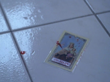
Cecilia Lisbon (13) is the youngest of the Lisbon sisters, described as the 'weird sister' An odd, withdrawn girl with a unique fashion sense and ‘no real friends’, Cecilia is represented as shy and mystical. The laminated picture of the Virgin Mary seen here at 1:18 was held and dropped onto the floor by Cecilia when the incident took place. This picture is one of the many symbols in the book and movie, symbolising the mystery and intrigue around the suicides. The Virgin Mary represents the Lisbon sister's tragic fate, the same as Mary's in the Bible, it also allows the girls to communicate with the neighbourhood boys through the number of cards hidden around their area. The Virgin Mary is portrayed as a mysterious figure similar to the personality of Cecilia as she's the hardest Lisbon sister to understand, adding a sense of mystery and drama to events happening later in the movie. The Virgin Mary cards add a sense of wonder with symbolic relevance, representing the narrator's inability to question what drove the Lisbon girls to suicide. From the scene in the bathroom, the initial narrative of the opening scene has completely changed as it goes from positive, calming, and peaceful to gloomy, depressing, and dark.


555-MARY ‘Bringing her message of peace to a crumbling world’


The movie title is written in different fonts 


Next, the audience is introduced to all five of the Lisbon sisters, Bonnie (15) is the middle daughter, having a sallow complexion, a sharp nose, and a long neck. Bonnie is portrayed as docile and reserved, being the tallest out of all of her sisters, and doesn’t get much attention in the novel. Mary (16) is the second oldest, mindful and attentive to her appearance, prim, and proper as she spends hours in front of a mirror. Therese (17) is the oldest of the Lisbon sisters, studious and interested in Science. Therese attends Science conventions, reads textbooks, and grows seahorses, her physical appearance is described in the book as having a ‘heavy face, the cheeks and eyes of a cow and two left feet. The exposition is told by the neighbourhood boys who have a fascination with the sisters. The sisters are described as 'mystical' and 'intriguing' by the boys in the neighbourhood, having strict, religious parents, giving the sisters limited freedom. Religion is a big factor in the lives of the Lisbon family, Mrs Lisbon is a devout Catholic with strict rules in place to keep her daughters in line. Religion becomes a punishment for the girls and an unsatisfying source of comfort for Mr and Mrs Lisbon after tragic events take place. ‘Virgin Suicides’ is an example of religious symbolism in itself, referring to the Virgin Mary and linking back to the laminated cards.


Pride and Prejudice (2005) is one of the movie adaptations based on the novel written by Jane Austen. The opening scene is set in the fictional market village of Meryton, Hertfordshire, the weather is bright and crisp as the morning air sets the scene of a calm and peaceful countryside. ‘Dawn’ is the song used in the opening, performed by Jean Yves Thibaudet, it is also the main song used in the movie. 


The first character that the audience is introduced to is Elizabeth Bennet, highlighting her importance as the protagonist in the movie. She’s the second eldest of the five Bennet daughters, Elizabeth is known as the most intelligent sister, being quick-witted and high spirited. Pride and Prejudice is described as a classic romance tale following the character development of the main character, Elizabeth Bennet. Elizabeth is regarded as the most admirable and endearing of Jane Austen’s heroines, being one of the most beloved characters in literature because of her complexity.

The Bennet family household is shown in the next scene, consisting of Mr and Mrs Bennet and their five daughters, they’re seen as middle class landowners in comparison to the other families in the movie. Jane Bennet is the oldest sister, she’s considered to be the most beautiful lady in their neighbourhood, described  as shy, and sweet, Jane is favoured by her mother because of her outer beauty. Mary Bennet is the middle child of the five daughters, Mary is ‘plain and solemn’ in comparison to her other sisters, mainly seen reading books and playing the piano, she’s much more sensible than her two younger sisters. Catherine Bennet often called ‘Kitty’ by her friends and family is the fourth Bennet sister, Kitty is in the shadow of her younger sister Lydia, often repeating her opinions. Lydia is the youngest Bennet sister, described as strong, attractive and charismatic. Being the favourite child of Mrs Bennet because of their similarities, Lydia is preoccupied with gossip and socialising, Lydia is often reckless and impulsive. Like her daughter Lydia, Mrs Bennet is shameless and silly, invested in getting her daughters married to suitors that meet her expectations. Jane Austen uses the character of Mrs Bennet to highlight the necessity of marriage for young women. 


In the opening scene, the exposition of the Bennet family is told through their chaotic household, with Kitty and Lydia running through the house, Mary playing the Piano, and Jane doing some embroidery. Set in 1811 and 1812, one of Pride and Prejudice's bigger themes is class. The Bennet family is seen as lower-class in comparison to the richer families later seen in the movie, the character's wealth is displayed through their homes and furniture. In the last few clips of the opening scene, the Bennets' middle-class lifestyle is shown through their home, the animals, and the sister's simple and plain dresses for that era showing the audience their class.

Magazine designer research 15/11/2023:

Born in Austria in 1908, Cipe Pineles was an Austrian graphic designer who was best known for being the first female art director of major magazines such as Seventeen, Charm, and Mademoiselle. Pineles was the art director of Glamour magazine and this is where her style developed into a playful modernist through various uses of image and text. Despite struggling to enter the workforce because of sexism in the design industry, Cipe became an influential designer, illustrator, and art director. Her work was described as 'Brilliant and brave, she combines images and white space, and typographic balance to achieve layouts that are witty, charming, and dynamic' by Jane Sayer, director of Visual Strategy at Smith Designs. Cipe Pineles went on to be inducted into the Art Directors Club of New York in 1943, receiving many awards of which she was the first woman to receive some of them. While working for Charm magazine, whose target audience was young and intelligent, Cipe used this trend in her magazine designs to educate teenage girls. Using contemporary artists, the education paired well with Pineles's best work.

Cipe influenced the use of fine arts to illustrate mass-market publications, bringing attention to the young mainstream audience and introducing commercial art to the fine art world.


Double-page editorial for Charm magazine, 1954

The reason I chose this piece of Pinele's work is because of the imagery, the 'parking entrance' sign stands out the most to me. The colour scheme of the spread matches perfectly with the background and the advertised product. This spread has done a great job of appealing to its targeted audience through its use of persuading words such as the 'newest, sleekest automobile'.


Pineles won a gold medal at the Art Directors Club for this potato spread created for Seventeen in 1948, the colourful imagery and the fun fonts are what I like most about this spread.


Created for Charm magazine, 1953 

WWW timeline 17/11/2023:
In 1945 Vannevar Bush wrote an article about a photo electrical mechanical machine known as Memex, which could make and follow links between documents on microfiche. Memex influenced the development of early hypertext systems, eventually leading to the creation of the World Wide Web.


Sketch of the Memex machine

The World Wide Web was developed in 1989 by Tim Berners Lee, a British scientist. The first proposal was written in March 1989 and the second in May 1990. He wrote the first version of HTML, (HyperText markup language) the document formatting language that became the primary publishing format on the web. The basic idea of the World Wide Web was to merge the evolving technology of computers, data networks, and hypertext into a global information system that's easy to use. By the end of 1990, Tim Berners-Lee had the first web browser running at CERN, demonstrating his ideas. he developed code for his web server on a NeXT computer.

  • HyperText markup language (HTML) is the code used to structure a web page and its content. HTML consists of elements that you enclose or wrap different parts of content to make it act a certain way. HTML uses 'markup' to annotate text, images, and other content for display in a web browser. 'HyperText' refers to links that connect a web page to one another, either within a single website or between websites.
  • The Hypertext transfer protocol (HTTP) is the foundation of the World Wide Web and is used to load webpages using hypertext links. HTTP is an application layer protocol designed to transfer information between networked devices and runs on top of other layers in the network protocol stack. In the past, HTTPS has been used for payment transactions, more recently it's been used for securing accounts, encrypting communication, and protecting page authority.
  • Cascading style sheets (CSS) is a stylesheet language used to describe the presentation of a document written in XML or HTML. CSS describes how elements should be rendered on screen, paper, speech, or any other media. Designed to enable the separation of content and presentation, including layouts, fonts, and colours. This separation can provide more flexibility, and improve content accessibility.
  • A hyperlink is a text or an icon that you can click on to take you to another website. There are types of hyperlinks, internal and external. An internal hyperlink is a link that connects the different subpages of one domain, usually organised in a web that's known as a link structure. An external hyperlink connects users to a different domain, either as an outbound or incoming hyperlink. Hyperlinks can also be categorised as text, anchor, image, and fat links.
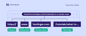
  • A URL (Uniform Resource Locator) is a type of uniform resource identifier that provides a way to access information from remote computers, cloud storage, and a web server. URLs are also used to locate a resource on the internet. URLs consist of multiple parts including a domain name and a protocol, a subdomain, and an extension.
URL structure
First proposal, March 1989


First web page address

This page contained links to information about the WWW project, including a description of hypertext and links to other web servers. The WWW design allowed easy access to existing information and an early web page that was useful to scientists at CERN. Berners-Lee original web page showed his vision and had many of the features that current web browsers have. In 1991, Tim Berners-Lee released his WWW software, which included the 'line mode' browser, web server software, and a library for developers.


Berners-Lee original WorldWideWeb browser, 1993

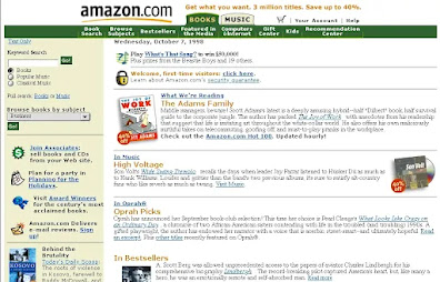
 On 21st April 1993, the National Center for Supercomputing Applications at the University of Illinois released the first version of the Mosaic browser. The Mosaic browser quickly gained popularity among the research community, offering a user-friendly graphical interface and easy installation. Versions of Mosaic became available on Mac and PC later that year. By the end of 1994, the web had 10,000 servers, 2000 commercial, and had 10 million users. Amazon opened for business in 1995, calling itself 'Earth's biggest bookstore', within a month the retailer had shipped books to 50 states and to 45 countries.


Amazon homepage, 1998


Current homepage

Internet Explorer was developed in 1995 by Microsoft as an add-on to the Windows 95 operating system. In 1996, Nokia released the first cellphone with internet capabilities, the Nokia Communicator 9000. Internet Explorer was integrated into the Windows operating system in 1996 and it soon became the most popular web browser. In 1997, Netflix launched as a company that sends DVDs to your home via mail, and Google.com registered as a domain in the same year. Users wrote over 20,000 Encyclopedia entries within the first year of its launching in 2001, Wikipedia was created by Jimmy Wales. In 2003 Apple launched the iTunes music store with 200,000 songs priced at 99c each, the store sold 1 million songs in the first week. 2004:
  • Thefacebook.com was launched by Mark Zuckerberg, and 1,200 Harvard students signed up within the first 24 hours
  • Blizzard Entertainment launched World of Warcraft, centered on the fantasy world, it allows players to form guilds and raiding parties
  • Apple introduces AirPlay
  • Nintendo DS was released 

Nintendo DS in 2004


Netflix's website design in 1999


iTunes website design in 2003

  Apple's Safari was released in 2003 as the default browser on Macs and then later added to the iPhone in 2007. Firefox was released in 2004, it was designed to address issues with speed and security. February 14th, 2005, YouTube was founded by Jawed Karim, Chad Hurley, and Steve Chen. The first video was uploaded by one of the co-founders, titled 'Me at the Zoo'. Apple released its first iPhone on June 29th, 2007, priced at $499 for 4GB and $599 for 8G. Web timeline events in 2008:
  • Apple launched the app store with 552 applications
  • HTML5 is introduced 
  • Groupon was launched by the Deal-of-the-day website
  • World of Warcraft hits 11.5 million subscribers, Guinness Book of World Records names it the most popular MMORPG


First Youtube video ever uploaded

 Google launched Chrome in 2008, the first browser with isolated tabs. Pinterest and Instagram were launched in 2010, in the same year the user-based question-and-answer forum, Quora was created by ex-Facebook employees. By 2013 Chrome had become the most popular web browser, and Internet Explorer was discontinued by Microsoft and replaced with Edge in 2015.


Google website design, 1998

Google's updated web design, 2023


Website structure 20/11/2023:

I created a website structure using Canva, I colour-coded the keys of the main pages and the information pages. I chose to use pink-based colours and used a pink crochet motif on the homepage. I used crochet websites such as Ribblr and the Glossier website as structure inspiration, I also added information about patterns and frequently asked questions, which is something most websites have for further information.


Primary and secondary website and magazine research:
For my website research, I looked at crochet magazines and websites as inspiration. HappyBerry crochet has good features of a website layout including:
  • Patterns
  • Information about their website
  • Articles
  • Video tutorials
  • E-books
  • Social media links
Using Pinterest to research website structures and Crochet magazines, I incorporated that into my planning and designs. A lot of the magazines I had seen had a big masthead that had 'Crochet' on the front cover and several patterns that could be found inside. I used the mastheads as inspiration for my magazine design, including the word 'Crochet' in a big and bold font. To make the website, I'll be using a free website builder, Wix. I've already started to create my website, starting with the patterns page, I used popular crochet websites as an idea of how the patterns page should look. On my website, there'll be about 5-6 pages including, information about us, patterns, contact information, FAQ, etc. Using my navigation structure to create the layout, a seasonal Christmas pattern subpage will be included under the 'Pattern' page. Focusing on the pattern page, there will be stitches for beginners, a help guide, and crochet abbreviations in both UK and US terms.


The abbreviations page should look something like this, I've been using a website called Ribblr for ideas, their website layout is organised and pleasing to look at because of their colour scheme.


Front covers of Crochet magazines, found on Pinterest. Notice how all of their mastheads are big and bold, highlighting the magazine topic. I also like how the typefaces are fun, using italic writing for some of them.


Magazine design evaluation 29/11/2023:


For my magazine designs, I chose the topic of Crochet, I researched Crochet magazines, spreads, and popular crochet websites to create the content spreads front page, and logo used on the front page of my magazine. I used Indesign, Photoshop, and Adobe Express to create my magazine content information as well as the front page. When creating the front page of my magazine I used a popular crochet magazine called ‘Simply Crochet’ as inspiration including patterns inside, making a masthead, and my logo in the corner. Using Photoshop to create my logo, I created a circle and used only two colours, grey and pink, having a design of a star motif to make it more colourful but still making it simple. The font of my front page is called ‘Quicksand’ created by Adobe Fonts, I switched up the fonts a little compared to my earlier research of using ‘Garamond’ and ‘Baskerville’. I added a plain, white border around the text used on the front page and my own picture of my creation of the ‘Mini bow bag’ in the background. I got a picture of a logo from Google to create the finishing touches of this front cover, including the price and date of this edition. For the main text on this page, I went for a more playful masthead, adding the colours of the rainbow to the first word, then opting for a more basic design. I tried to make the text as small as possible, using a font that’s easy and clear to read for my viewers.

Something that I would do better next time with this front cover is to make the ‘Mini bow bag pattern’ fit into the border as it’s hanging off the edge of the border a little bit, making it neater. I would’ve also liked to change the background picture since I didn’t take a full-view picture of the bag when I created it, giving my audience a complete picture of the pattern. Also including the strap and maybe I could’ve made the bow thicker? instead of just a bow made up of starter chains as it looks a bit messy to me. Something I liked about the front cover was the name of my magazine, I chose this name out of the three names I had in mind initially because that meant I could use different colours in the masthead, making it fun and lively. The main feature on my magazine page is the 'Mini bow bag pattern', making it the highlight since it's also the front cover picture. I used the colour Pink as the base colour on the front cover and the pattern page, although the text on the front cover's border could've been smaller since it wasn't 11pt. Some initial name ideas I first had for this magazine were similar to the name I picked, 'Colour Crochet' and 'Easy Crochet' were the names of choice I had in mind when I first started planning.


For my magazine page, I created a pattern for fingerless Crochet gloves pattern guide for beginners on Single Crochet. Using a picture of my own work, and adding the pattern that I used to create this. I created the pages of the spread using InDesign and replaced the original picture with the picture of the fingerless gloves as a kind of progress picture. The font that I used was mostly the fonts created by Adobe, the one I used on this magazine page, and the front cover is called ‘Quicksand’. To create this magazine page, I used a standard A4 size on a white background and used a hot pink colour for the text.
 I also added abbreviations and the stitches used for the pattern which makes it more accessible for people who are beginners or aren’t familiar with Crochet abbreviations. The pattern I used for this page was made by a website called  ‘Stitchandhustle’, I highly recommend this website because it has clear and step-by-step instructions for beginners. I also used a single Crochet pattern on the first page of the spread to link it to the main focus of the spread, my pattern. I added my own picture of what this design should look like halfway through as a progress check. Something that I would do better next time with this magazine project is to finish it earlier, completing it on time and not having to rush with making my magazine. I could also take better pictures of my Crochet work in clear and brighter lighting, showing the full and complete view of my finished projects. For my pattern spread I could make more use of adding more columns, making it neater and more spaced out rather than the text squashed together. https://www.stitchandhustle.com/free-patterns/astor-fingerless-gloves-free-pattern?format=amp


I remade the content spread, adding another page with the content of my magazine, using page numbers and lines to make it look more presentable. I kept my old design in as a reevaluation so I could look back at what I needed to do next time. I used InDesign and Adobe Express to create my content spread, creating a slogan and adding my logo designs to the top and the bottom of the first page. to the top of the page. For the background, I used white instead of the initial pink colour, I changed the text colours from purple to a hot pink shade, making it noticeable on the white page. For the content spread itself, I added patterns, Christmas gift ideas, resources for finding Crochet materials, and a beginner guide inside my magazine, I used the company ‘Simply Crochet’ as inspiration for the magazine designs. Using the smallest text, I used a font that's easy and clear to read but still looks neat and simple to my audience. The colours on this spread are grey, pink, and purple on another pink background. The first page looks very bare to me because of the white background, I’d probably need to add more colour next time to make it less plain.

UX and UI research 4/12/2023:


User interface design is the process designers use to build interfaces, focusing on the look, design, feel, and interactivity of a digital product. User interfaces come in three different formats;
  • Graphical user interface: Users interact with visual representations on digital control panels, for example, a computer desktop is a GUI. GUI's graphically display information and user-related controls, it can work by using a pointing device such as a mouse or a stylus.
  • Voice-Controlled interfaces: Allows users to interact with a device through spoken voice commands, VUIs give complete control to the user with their voice. Some well-known VUI's are Alexa, Siri, Google Assistant, and Cortana.

  • Gesture-based interface: An innovation that uses gestures as an input, e.g. virtual reality games.
  • A user interface is made up of input controls, containers, navigational elements, and informational components. UI design considers how these elements work together to create interfaces that are easy to navigate and pleasing to look at. Interactivity decides how the interface behaves and functions and visual design is how the interface looks, taking the colours and typography into consideration. Information architecture is how the interface is organised and labeled.


User experience (UX) design is the design of the elements that determine the interaction a user has with a product or service. It shapes a user experience. e.g. how the products make the user feel and how easy it is to accomplish tasks. UI refers to the interface of a product, the visual design of a screen a user navigates through a mobile app or buttons that are clicked when browsing a website. UI covers all the visual and interactive elements of a product interface, from colour palettes, and typography to animations and navigational touch points. A few examples of UX design include:
  • Content development
  • Product structure and strategy
  • Customer and competitor analysis
  • Development planning
  • Testing
  • Prototyping and wireframing
  • Tracking goals and iteration
  • Coordination with UI designers and development

Adobe XD experimentation 5/12/2023:
Using Adobe XD and the help sheet, I created and experimented with a website furniture format, starting with an iPhone 14 page. I used Adobe colour to generate a range of pinkish colours to add to the blank page, then downloaded the images of the furniture with Onedrive. Initially, I used a picture of the blue landscape room then I switched it to a picture of a pink chair to match the theme of the colour shades and my website theme. Making the #F5C6DA shade the main colour in the website format, I then dragged the images of rooms into my artboard folder and added text in the font Segoe UI and Lato. I created the navigation icons using the circle, line, and square shape tools to create the search bar and the option lines.


Room files


Progress so far, I still have to create another page and add other icons


Something that's missing is the sign-in and the shopping bag icon because I forgot to add them when I created the first page. I could've also made the direction lines bigger and bolder, it's not that noticeable when you first look at it and the search bar could be more spaced out on the first page because it makes it look a bit crowded. I changed the font on the first page from Segoe UI to Segoe print in size 33 pt to make it look more decorative. I had a pink theme, I used pictures from Google of pink furniture on the first and second page. For the pictures on the second and third page, I downloaded a range of sofa images from the furniture session folder


Planning documents 8/12/2023:

NICS:

Location Recce:


Risk assessment:


App planning 13/12/2023:


This is my mood board so far, I'm using Canva to create this. I used Pinterest and downloaded pictures of colour schemes, palettes, typefaces, and website buttons.

Website progress and layout 18/12/2023:

To make my website, I'll be using Wix, a free website builder. These screenshots are the progress of the website layout that I've done so far, I still need to add my information page, the masthead, and more pictures of Crochet, then maybe add some information for the FAQ page. I still need to change the colour shades of the site to a lighter colour like pink to match the shade of my logo. I also created a company email for this website, colourfulcroch3t@gmail.com, and added it to the Contact Us page.


Website menu so far


Completed pattern guides


Logo added as the header for my information page


Contact page and information, I might change the background colour or the colour of the text as it looks hard to read 


For the location, I used the address of the College


Auteur theory research:

Auteur theory is a way of looking at films that states the director is the 'author' of the film. The origin of the auteur notion came from France in the 1940s, dubbed with the name 'Auteur theory' by American film critic Andrew Sarris. The idea of auteur theory stems from an essay written by Alexandre Austruc (1923-2016) titled, 'The Birth of a New Avant-Garde: La Camera Stylo', translating to the camera as a pen. He suggested that directors should use their cameras as writers use their pens, capturing the details and defining the meaning of a film. It gained further traction during the French new wave style of cinema in the 1950s. An auteur director is someone who is instantly recognisable and consistent when you see their films. An Auteur is a director who is instantly recognisable, their style of filmmaking is consistent and transparent about their projects. Some examples of auteur directors:

• Sofia Coppola is an American film director, screenwriter, and producer. Born 14th May 1971 to Francis Ford and Eleanor Coppola. In 2004, Sofia was the first woman to be nominated for an Academy Award in the category of best director.


Some well-known films of hers include Marie Antoinette (2006), Priscilla (2023), and Lost in Translation (2003). Sofia's movies are usually set in comfortable settings, for example, in the suburbs or a boarding school, she uses strong-willed women as her protagonists. Coppola uses colour to build a point of view from a vibrant palette to how cinematography captures her female characters. She uses pink to convey this expectation with the hats in Marie Antoinette and Scarlet Johansson's wig used in Lost in Translation.


Priscilla (2023) follows the life of a 14-year-old Priscilla Beaulieu as she meets Elvis Presley while her father is stationed in the U.S. military, giving the audience a personal look into the stages of young womanhood and growing up as a teenager in Graceland.  Starring Cailee Spaency (Priscilla Presley) and Jacob Elordi (Elvis Presley) this movie gives us a personal insight into the life of Priscilla behind the scenes. Priscilla premiered at the 80th Venice International Film Festival on September 4th, 2023

Opening scene information:  

Yesterday, I shot the rough cuts of my opening scene, using a Nikon d3500. I shot the first half of the beginning and experimented with different shots and angles to see which ones would fit my opening scene the best. I found a building nearby to me, an Anglican church, St Gabriels in Willesden Green. Built in 1897, St Gabriels inspired the renewal of the Church to proclaim Christ in serving the people of Cricklewood and Willesden. The location changed from the last time that I reviewed the planning documents and I've decided to shoot somewhere that's more local to me, Golders Hill Park and the Pergola are great places to film my opening scenes as it has good scenic views and fit with the genre of my project. The exterior of the Church really fits in with the genre of my opening scene, the colour scheme of the building, and its surroundings. I plan to record the rest of the footage in Golders Hill Park and the Pergola Garden with my iPhone 11.  When I'll be filming, the setting for my scenes will be gloomy, and dark but not raining so the focus will be on the buildings rather than the wet weather. *Need to check the weather forecast for the week that I'll be filming the scenes*


In this photo, one of the main characters, Cassie Ainsworth is standing on top of a bench. I'm choosing to base one of my scenes off of this, not the context of this scene but the mannerisms and the costumes of Cassie. For one of the scenes, my character will be standing on a bench so a weather check is needed to avoid any injuries. I chose a scene from a popular British TV show, Skins to set the scene of what I would want my clips to look like. 


Taken on a Nikon camera. I focused on the exterior of the Church rather than the interior because of the details on the exterior such as the window detailing above the door. *Scene 1*:

The start of my opening scene will start off with the two characters standing outside the Church. The two characters start to question if they should enter the Church, then the bell tolls and they quickly run away. This starts the next scene as the camera pans to a dark setting with a scenic view.


These are a few experimental videos / rough cuts that I recorded, it got dark really quickly throughout the recording process so some of the videos are darker than the first half. I recorded the exterior of the Church starting from the top to the bottom, the middle and the edge of the building, etc. I focused on the Church itself because it fits the setting of my opening scene with the dark colour scheme, detailed windows, and the clock. To edit my scenes, I'll be using Adobe Premiere Pro, since I've used this software before to edit footage.


Satellite view of St Gabriels, found on Google maps

The second location of my opening scene will be nearby, Golders Hill Park is a local park that I visit often because of how familiar I am with it. The second location is where the audience is where I plan to show that my characters are running away. This location is deserted in the early mornings, making it easier to film my characters. Here are some photos of Golders Hill that I've taken, there's plenty of space to film near the pond and the Pergola. 


Outside view of the Pergola garden


Golders Hill Bird Pond

The walking distance between the park and the garden is very short and an accessible route. For the exterior of the opening scene, I'm going with a theme of classic places, such as Churches or historical buildings. The scenes will start with a quick shot of the Pergola, and then the camera will pan to the characters walking up the stairs to the actual entrance of the garden itself.


This is the 20-minute journey from St Gabriel's to Golders Hill Park, I can take either the 245, 260, or 460 bus making it an easy route to use 


Map of the Hampstead Heath trail, I screenshotted the area that I'll be filming in to show the close distance, many facilities are within close proximity of each other such as toilets and bus stops. The entrance I'll be using is a 1-minute walk from the Bandstand, and all of the locations in the park are within walking distance of each other. 

For the music and the sound effects, I'll be using YouTube to find music and the website https://freesound.org/. Here's a list of some songs that I could use that would fit the theme of my opening scene:

These are some of the music options that I'm considering for the beginning of my opening scene, music will be included for a short duration of 0:00 to 0:30 as an introduction. Twilight by Bôa, https://youtu.be/wPAjvd0Co-Q?si=ZRan8Kxa4BdYfHw2

Oblivion by Grimes https://youtu.be/JtH68PJIQLE?si=evQjcKPXE9WC2iZs

when you sleep - my bloody valentine https://youtu.be/hcOhXThqh_0?si=VpXhZFgpFzpVAMK6

Quiet, The Winter Harbor - Mazzy Star https://youtu.be/WBbEVzgoEhA?si=0NHDAc1MWyKATgWM The first thirty seconds, 0:00 - 0:30

For the middle part of the opening scene, I thought of using sound effects instead of including music to give off the impression that there's tension between the characters is going to happen to the audience. I used the website https://freesound.org/ for the sound effects, I think a sharp piano or a violin would fit well into the start of the middle scenes. These are some of the options that I liked the most:

Piano:

https://freesound.org/s/470479/

The piano instrumentals in the song 'Runaway' by Kanye West could also be used in both the beginning and the middle of my opening scene

https://youtu.be/fxdJInWWGtU?si=4PU-L6_R9RhH1D9P

Violin sound effect: 

https://freesound.org/s/56065/

I think these two would work well together because of the sharp sounds, I can merge these together using Premiere Pro

https://freesound.org/s/714169/

https://freesound.org/s/659582/


The first narrative that I created for NICS hasn't changed that much. When filming the end scene, the ideal time to shoot would be around 5-6pm when the sun starts setting earlier because of daylight savings. As for the setting it could be set in a less busy part of the city, e.g. an empty park shot in the late afternoon or evening. The setting for the middle part of my opening scene will be set in Golders Hill Park. To find the less popular times to film I used Google Maps and looked at the popular times to visit, 9am to 11am isn't very busy and that would be a convenient time to film.

The setting for the busier scenes will be filmed near Blackfriars Station, which has a great view of the famous landmarks in London. The Tate Modern is within walking distance of the station so it's nearby and accessible. As for the middle part, Blackfriars Bridge and the Millennium Bridge are close by so I can film the characters standing on a high Bridge that's stated in my narrative. The location for the views will be the Bankside, a 7-minute walk from the station. I'll be filming the Bridge scene on the Millennium Bridge since it's high, has a good view and you can film from below on the street.

Sound definitions:

Diegetic: Diegetic sound is any sound that comes naturally from the world of a film. If the characters can hear it that means that it's diegetic. The sound isn't always on-screen, many diegetic sounds are featured off-screen. Some good examples of diegetic sounds are music, sound effects, and dialogue. Diegetic dialogue is a simple example of this, it occurs between characters as a form of verbal communication. Music is another element of diegetic sound in film, it can function across the diegetic line into non-diegetic sound. Music on a record player or being performed by a. band off-screen falls into the category of diegetic sound. 

Non-Diegetic: Non-diegetic sound is sound that doesn't originate from the world of film, these sounds are normally added in the post-production. Roger Odin created the term in 1967 and has since been used to describe sounds such as a song, noise, or silence. Character narration, soundtrack or music overlay, and sound effects outside of the film world are examples of non-diegetic sound. 

ADR (Automated dialogue replacement): ADR is the process of re-recording an actor's dialogue in a quiet environment, normally during post-production. During an ADR session, the actor watches a looped scene of themselves to dub new dialogue over the original production track. ADR is used to improve the audio quality, add voiceovers, alter lines, or fix a performance. Steps to record an ADR session:

  • Pick the scenes that need ADR
  • Soundproof the room to make sure that there aren't any distractions, and cover the windows and the walls with blankets to minimise echoes. Providing the performers with a pair of noise-canceling headphones are good to have when recording an ADR session
  • Get a good-quality microphone, the dialogue recording should be clear. A microphone with a broad dynamic range to capture the right quality of sound to match your production audio
  • Record multiple takes, ADR allows you to capture multiple versions of additional dialogue with different tones from the performer 
  • Add sound effects, use the appropriate software to mix the sound, and match the audio dialogue over the lip movements to make the new dialogue sound as close to the original track as possible
Foley sound: Foley was first used in radio broadcasting in the 1920s, rather than using sound effects from a sonograph radio studios hired sound artists to create effects on cue. The most well-known of the early sound artists was Jack Foley, who moved to the film industry and pioneered the methods and techniques that are still used to this day by foley artists. Foley artists create everyday sounds such as footsteps, glass breaking, wind blowing, etc. These sound effects then get added into the edit during post-production which enhances the auditory experience during a show or a movie. The three types of foley sound are feet, movement, and specifics. Made in large recording studios that are equipped with thousands of objects, textures, and surfaces artists can use to recreate sounds. These are some ways that Foley can enhance a film:
  • Foley sound can make a film more realistic
  • Makes a scene more immersive. Sound is a key element of storytelling, it creates a sense of atmosphere and draws viewers more closely into the story
  • More believable ambient sounds, background, and ambient sounds usually aren't loud enough to enhance the scene in a field recording so foley artists recreate them in the studio to be louder and more realistic
  • Too quiet. Movies without background noises are too quiet, foley sounds make the scenes feel more natural

Updated narrative:

For the opening scene, I'll be using three locations in total. The first location is my house, the exterior of it will be filmed, including the door and the gate. The second location is St Gabriels Church, again only the exterior will be shown as it's only a short scene, maybe 30 seconds or less? Location #3 is going to be at Golders Hill Park, it's not as busy as some of the other locations that I considered so I think it'll be good for filming with minimal interruptions. The actual script could be longer. It could include more dialogue between the characters to convey their emotions, but I think I'll leave it as it is for now to leave some mystery at the end of shot 3. I don't think I'll be using that many props as the only key thing my characters will need is a backpack because of their situations.

As it's very busy in the afternoon, I'll have to film when in the early morning or late evening. For the filming equipment, I'll only be using my iPhone 11 since it's easier to save files with the 'Photos' app. There will be a few props used, such as hats and other accessories. Here are some short videos of the locations for visuals. The entrance to Golders Hill Park is in the first video, it's walkable from the main park. 

I created my script with Word, using the font Courier New in the size 12

My script: 


Script notes: *The two characters are called Juliet and Serena. Two teenagers who are thinking about running away from home, my opening scene portrays their emotions through their actions in the shots. * Serena and Juliet are dressed in the typical fashion for a teenager, e.g. a black or white shirt, trainers, and a hoodie, dressed in casual wear. Shot 1 starts off with Serena looking distressed as Juliet is in a hurry to get out of her house. Serena keeps watch for someone or somethingThe camera focuses on the exterior of the Church for the first 4-5 seconds, then the two characters are seen staring up at the church's door. They start to question if they should enter, Juliet and Serena wonder if there is a God who can help them through this. My opening scene will be set outside so most of the script will be featuring the exterior rather than the interior of the location of the buildings. There are various entrances to the park but for these scenes, my characters will enter through the W Heath Ave entrance, close to the tennis court. The camera will be recording from outside the park as Juliet and Serena get off the bus. A long shot would be the ideal camera shot as it shows the full view of both characters. There’ll be a shot where the girls are walking up the hill to the benches around the bandstand. The characters look for somewhere safe to stay, shots of them looking around the bridge, pond, and garden are shown 


Some of the videos are showing up as unavailable so I copied and pasted the links and created a OneDrive folder instead. Golders Hill Park closes at 4:30 so that means that there's very little time to film, I shot all of the scenery videos in my spare time, leaving more time to film with the actors. I've decided to just film in the park instead of in the Hill Garden since it closes at 3:30, which doesn't leave me enough time to shoot the scenes. This is the West Heath Ave entrance, I'll be filming the start of scene 3 with the characters walking in the park. I had to change the initial final location from Golders Hill Park to Hampstead Heath as Golders Hill Park closes early in the Winter seasons. I don't think I'll use the scenery videos that I took in Golders Hill as it doesn't match up with the weather and the time stamps of the shots.

Links to the short videos:


This is the hill that leads up to the bandstand. This is where Juliet and Serena set up camp, when I shot this video, the weather was very windy so the camera is tilted at an angle. To leave enough time for the musical elements, it'll be added in at the beginning of the opening scene, introducing the characters with tense music. I haven't yet decided on what song to use for scene 3, so there'll probably be some kind of instrumental sound effects such as a sharp Violin or a Piano. Short video of the Bandstand. The actual area is locked as it's used for performances so I'll be using the surrounding area because it's emptier than most areas in the park. 


This is a folder of all of the short videos, I took multiple in the same location to test out the different shots and angles.

Opening scene evaluations:

For the topic of my opening scene, I went off the theme of escape. There are two main characters included in the opening scene. Juliet and Serena are teenagers who are deciding if they should run away from their home situation, my opening scene follows their journey through to safety. The initial filming location had changed several times. It was mostly because of Golders Hill Park closing earlier than I expected, leaving little to no time for filming.  I chose Hampstead Heath for one of the final filming locations because it’s open 24/7 making it easily accessible through bus and overground services. For my opening scene, I used two actors, my sister and her friend. The costumes were true to my narrative, with the actors wearing basic black clothes. The duration of the video might change when I finish adding any touches but it’s 2 minutes and 30 seconds. I made sure not to make it too short so I used some silent shots to fill in the gaps with no dialogue included.

 I took some scenery shots of Hampstead Heath but I made sure to use the flash as was very dark when I filmed, for the first silent shots I used music to replace the background noise so there are no distractions from the actors.  As for the music, I kept it minimal and only used one song, ‘Runaway’ by Kanye West. I found an instrumental version using the app https://hipstrumentals.com/2021/09/kanye-west-feat-pusha-t-runaway-instrumental-prod-by-mike-dean-jeff-bhasker-emile-haynie-kanye-west/ I then downloaded it onto OneDrive and uploaded it onto Adobe Audition to edit and shorten it to the length of my choosing. I chose to use the beginning of the song, the piano instrumentals because I feel like that fits into the theme of tension in my opening scene.

The process for the opening scene was easier than I expected it to be, I used Adobe software such as Premiere Pro for desktop editing and Premiere Rush for mobile editing. I’ve also used Adobe Audition to alter the length of the instrumental from 9 minutes to less than 30 seconds to include a musical element in the introduction. When editing, I tried out two different methods, scenes with music and scenes without it as a test. This is the first edit that I used for a trial run, most of the improvements that I’ll talk about are the same as in the second cut. For the text, I added a page with a duration of 5 seconds, then I used the font ‘Cardo’ in the size 61.9 to make it easier to read. The videos might show up as unavailable so I’ll insert a link.

 Opening Scene without a soundtrack 1/2


Without the soundtrack in the first video, you can see that it’s awkward especially when there’s no dialogue in the scenery videos. Something I definitely would’ve done better next time is to work on the use of camera angles. In one of the last scenes where Juliet and Serena toss their backpack, I shot the scene in portrait mode instead of landscape which ruins the whole video in my opinion as it looks out of place. However, it gives the scene a natural feel, almost as if someone is following them or listening in on their conversations. The lighting contributed to the quality of my opening scene, it was very dark when I started filming and it only got darker so I had to rely on the street lamps when shooting the outdoor scenes. In some of the shots, you can see the glow of the streetlights which might distract the audience from the scene. If I were to do this next time, I would have to consider lighting if I choose to shoot at any outdoor locations.

The Church scene needed some type of soundtrack, in the beginning, you could hear me say ‘Go’. I tried to cut it out but it was hard without removing a quarter of the dialogue between the actors, so I chose to include music on a low volume to mask it instead. 
The opening scene with a soundtrack 2/2:


For the second version of my opening scene, I used Premiere Pro and Adobe Rush to edit these scenes. When editing the first half of my video, the top part of my first shot of Juliet's face is cut off. For next time I'll need to consider the camera shots and angles more The duration of the second video has the same duration of 2 minutes and 30 seconds just with a soundtrack added in the background of the videos with no dialogue. I cut and adjusted the song 'Runaway' down from 9 minutes to less than 35 seconds, I used an instrumental version downloaded from the website 'hipstrumentals'. Something to note when shooting these scenes is that the camera quality could've been better, it's blurry in some scenes and that makes it hard to see the characters clearly. For the credits, I created 2 pages, using the same font and size and including the names of the actors. The soundtrack sounds a bit off in some parts, almost like the instrumentals were overlapping, but it still fits with the theme of my opening scene. It was difficult to choose the right timing in the song that would fit into the scenery shots of the opening.


I downloaded it directly from the MP3 site and uploaded it onto the files app. I listened to a few bits of the song to pick out what would work best for the credits and silent shots.

I decided to use this part of the song, the piano instrumentals really work well with the initial silence of the shots with no dialogue. As for the sound, it could definitely be better in some places. In the scenes with talking you'll notice that the sound is low and hard to hear in some areas, max volume is the only way to hear the actors talking clearly. Something to consider when I make this again is to have a good mic, making it easier to hear the characters where there's dialogue. Checking the weather forecast was a big thing that I had to consider when shooting the scenes, it was a bit windy so I had to redo multiple shots to make sure that it wasn't that much of a distraction to the audience. It was about 6pm when I began shooting the outdoor scenes and it was already hard to see when we started walking up to the main filming location in Hampstead Heath. I used Adobe software to edit both of these opening scenes. I found a similar version of Premiere Pro but in a mobile version called Adobe Rush, I used this to edit on my phone and used Premiere Pro on the desktop. I added the audio using the 'add media' option uploaded the full song below the scenes and then cut it to fit into the shots.

No comments:

Post a Comment

Info

About me: I'm Anna and some of my hobbies include: Crochet Baking Reading Writing  Some of the music artists that I listen to are: Lana ...